Stylishly fold your latest into your back pocket1
“That note. It's a fake, right? You should fold it.” In the 2002 movie, ‘Catch Me if You Can’, teenage con-artist Frank Abagnale, Jr., helps a schoolmate convincingly use a phony note in order to get out of class early. He urges her to fold the note in half, as she would if her mother had given her the note to bring to school, and put it in her pocket. “If it's real, where's the crease?”
As part of a book’s production process, folding is what happens after printing and before binding. Though for a number of publication types, i.e. announcements, broadsides, handouts, leaflets, letters, pamphlets, zines… folding is binding or goes beyond the potential that plain book binding has to offer. It’s maximum efficiency from a minimum of effort.
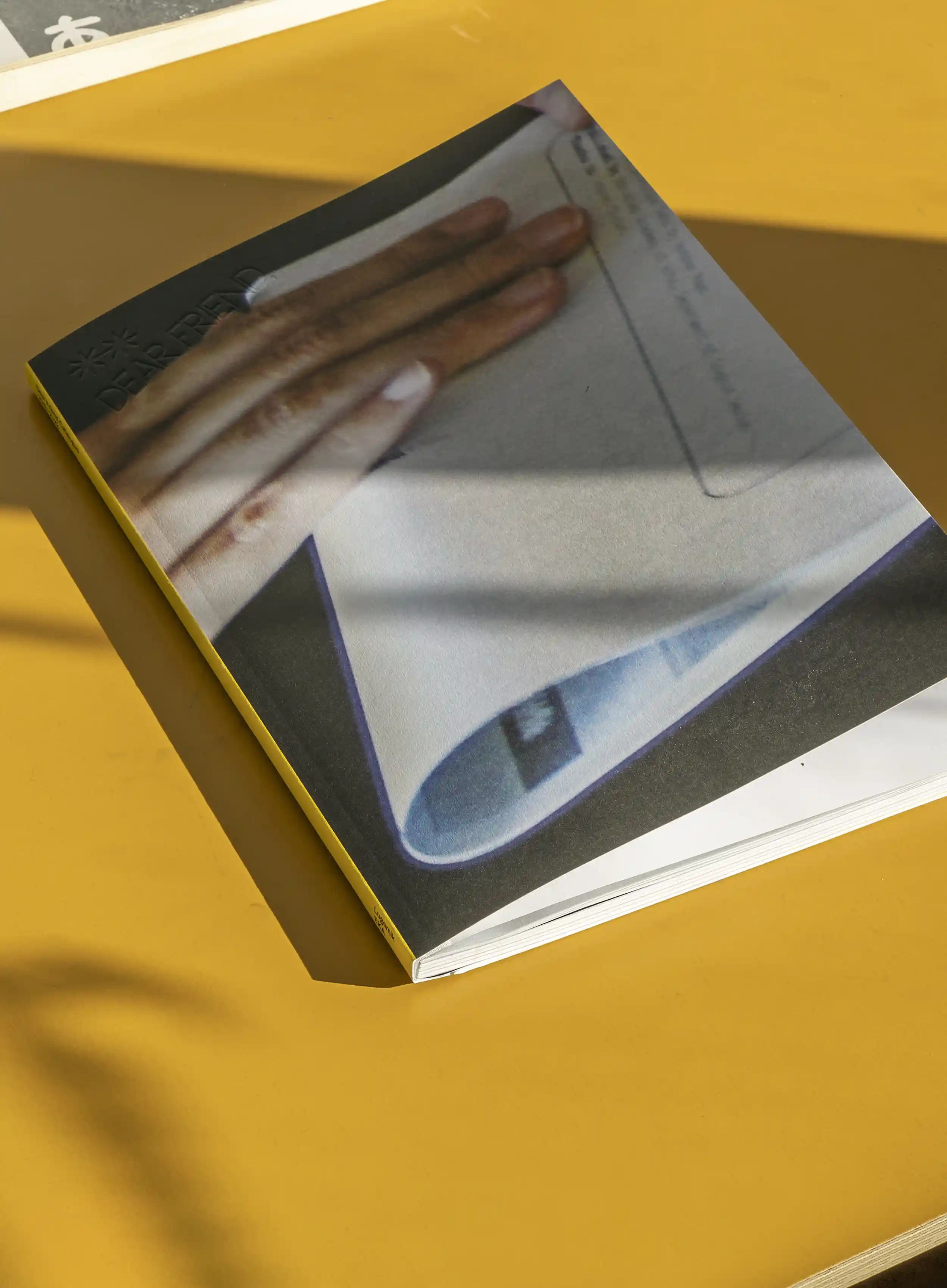
Dear Friend is an open letter published by Ott Kagovere and Sandra Nuut. It is designed in, printed at, folded by and mailed from the Department of Graphic Design at the Estonian Academy of Arts in Tallinn. It’s a publication where the acts of inspiration, production and distribution are closely related. For this to unfold, it depends in some part on a number of sympathetic factors that are fulfilled: the publishers are gainfully employed at an institution, have mailroom privileges and are able to depend on a network of writers/designers/artists who can write a letter. This dependency has something to do with mutualism? (Soft) parasitism? Or, as Nils Norman, co-initiator of the artist’s group ‘Parasite’ (1997-1998) called it, “to piggyback [...] institutions utilising the host institutions' infrastructure in exchange for content provision.”2
The folded publications we encounter, unlike the books that convincingly take up bookcase real estate, are very in between. They arrive in our mailbox, but we also pick them up somewhere, find them or they somehow just ‘end up’: in a stack, between books, between pages, in your pocket.
They come pre-folded or are folded by the end user. They have a tightly scored crease, made with a folding bone, on a machine, on a table. Or they’re folded using your fingers, the back of your hand, on your legs, your lap, a table, a wall, in the air.
Half Letter Press (named after the format created by folding a letter-size (215 x 279 mm) sheet of paper in half) is the publishing imprint of artists Mark Fischer and Brett Bloom. ‘Towards A Self Sustaining Publishing Model’, published in 2021, is a half letter sized publication with a frantic text by Fischer that lists a number of considerations on sustaining this publishing model.
“Figure out the cheapest and least wasteful ways to do everything.”
“Design a publication around the paper that you found for cheap.”
“Make the copies at work.”
“Hopefully the ability to print impulsively and compulsively will result in good work.”
Traditionally, newspaper front pages are divided into sections above and below the fold, with more importance being placed, both for headlines and advertisements, to what happens above the fold. In this text, however, we’re not talking about those folds, where ‘folding’ is used as a method to create hierarchies and separations. Instead, we fold in order to distribute, to carry. Folding it to put it in an envelope, to carry it in your pocket, into the future.
On the Museum of Modern Art’s website, I’m looking at the images of the 2017 exhibition ‘Charles White – Leonardo da Vinci’, curated by artist David Hammonds. On the website are reproductions of the artworks in the exhibition, along with photos of the pristine installation.
Charles White: ‘Black Pope (Sandwich Board Man)’, 1973, oil wash on board, 60 x 43 ⅞ in. (152,4 x 111.4 cm).
Leonardo da Vinci: ‘The drapery of a kneeling figure’, c. 1491-94, brush and black ink with white heightening on pale blue prepared paper, 8 ⅜ x 6 ¼ in. (21.3 x 15.9 cm).
A bench in the center of the space.
Delicate wall texts in the distance.
A display of handouts.
I visited the exhibition but feel no connection to these images.
The exhibition was located in the middle of a busy thoroughfare on MoMa’s 5th floor and the handout, left over from the exhibition, brings me right back.
A sheet of paper measuring 505 x 670 mm. One side displays reproductions of the artworks, they’re placed haphazardly on a perfectly kitchy background depicting a starry sky. On the other side of the paper, White and da Vinci’s natal charts by Vedic astrologer Chakrapani Ullal (both artists were born in the first part of April – 466 years apart).
Now I’m reading their charts, just as I did when I visited the exhibition in the museum, while a theme park-sized crowd squeezed by me. I unfold it, read the unwieldy sheet, fold it back up like an accordion, read, fold, read, unfold, fold.
Shannon Ebner
STRAY
June 22 - July 29, 2017
Eva Presenhuber
39 Great Jones New York, NY.
ISBN 978-3-032-06260-3
© 2017 Shannon Ebner, Galerie Eva Presenhuber
Design: Mark Owens and Shannon Ebner
Type: Galore by Dinamo
An exhibition I didn’t visit, but somehow I’ve ended up with a copy of the catalog. It’s a 705 x 1010 mm sheet of paper with images strewn about in a grid, created by folding. A drawing of a vinyl record. Text. Captions.
I look up the installation images of the exhibition and recognize everything: a door with a sign that says ‘Friends in Deed House’ hanging above it and a figure knocking at said door, multiple photos of birds in flight/fall, the word PHOTOGRAPHY behind a window, a portrait, the cover of Walker Evans’ American Photographs book, a flag, signs, tree trunks. These are images I’ve now lived with for some time, as I’ve gotten very attached to the catalog, folding and unfolding it, the creases have become grimey and the catalog of images has somehow replaced the exhibition.
“A people is always a new wave, a new fold in the social fabric; any creative work is a new way of folding adapted to new materials”3
Throat and Column by Claudia Pagès Rabal, Published by Centre D’Art La Panera-Sala D’art Jove, 2016. Designed by Ott Metusala, ISBN: 978-84-96855-84-7.
The publication was originally published as part of a performance and an installation. The text in the publication is printed in a myriad of directions. The publication is printed on plastic and was presented as a thick roll. Visitors could rip along the perforated line and leave with their own 500 x 880 mm plastic sheet. I guess I could have crumbled up the sheet? I’ve folded mine. A straight crease down the middle, a straight crease across and some additional skewed creases.
I vaguely remember Claudia telling me it was a concerted effort to print on plastic, that the usual handout from an exhibition is something we easily pick up and then later easily dispose of but when you want to get rid of plastic, it’s not that easy.
“[...] it was a lot about folding. Like an exhibition handout, I normally fold it until it fits in my pocket. That plastic was not that easy. A friend used it to wrap their toothpaste and toothbrush and then read it in the hotel while cleaning their teeth.”4
Dear Friend is riso printed on a standard A3 sheet of paper (420 mm x 297 mm), folded in half, folded again, sealed with a self adhesive label bearing the addressee’s name and address, stamped in the school’s mailroom and sent out around the world.
As the forms of the publications are recognizable: exhibition handout, poster, plastic sheet, mail… similarly do the texts in the publications piggyback on known forms: letters, rants, charts, catalogs, scripts.
“Dear friend,
Thank you for your very fine letter and for the suggestion that VICE VERSA compile a list of lesbian literature. The list which you very kindly sent has been included in this issue. I hope that other readers will send in additional titles of books, either fact or fiction, on this subject. [...]”5
‘Vice Versa’ was published monthly between June 1947 and February 1948 in an edition of six copies. The entire edition was produced at the typewriter: one original and five carbon copies, typed by editor Lisa Ben (anagram: lesbian) while employed as a secretary. Presumably letter sized, the pages were punched for a three-ring binder. All issues have been made available online.6
“It is hard to believe that for every printed letter a human finger hammered it into place. Seeing a letter transports us into the idea without further inquiry into all the moments that led up to that imprint’s existence. The typo consequently reminds us of the intractability of the signifier in relation to the signified and of labor in relation to management. The laboring fingers of secretaries are the hammers that strike their ‘nails’ into the ‘wood” of paper.’7
“A neat format and typographical excellence are valuable assets in presenting educational ideals to the public. (I meant to type ‘ideas’, but perhaps ideals has relevancy too.)”8
Dear Friend arrives in your mailbox (or not), you open it (or not), unfold it, read it, fold it, store it, stack it, get rid of it, find a spot for it, remember it, forget it.
-
“Why not just xerox your favorite new poems from time to time and hand ‘em to your friends? Or better still, why not stylishly fold your latest into your back pocket and show it to the several people who matter? How many people’s taste do you trust?”, by Eileen Myles in A Secret Location on the Lower East Side, eds. Steven Clay and Rodney Phillips (New York: Granary Books, 1998), 223.
-
https://www.dismalgarden.com/index.php?q=collaboration/parasite
-
Gilles Deleuze, Negotiations (New York: Columbia University Press, 1995), 157
-
From correspondence between Claudia Pagès Rabal and Lieven Lahaye, June 2022.
-
Vice Versa: America’s Gayest Magazine 1, no. 2 (July 1947) 19.
-
https://queermusicheritage.com/viceversa.html
-
Duncan Smith, The age of oil (New York: Slate Press, 1986), 176.
-
Vice Versa: America’s Gayest Magazine 1, no. 2 (July 1947), 17.